Posted on Leave a comment

Frogs . . . and Words

As I prepare for some fall exhibitions (Diving In and Westward Bound II), I ponder how similar my approach to ideation and creation of both book works and of exhibitions is. Both are lengthy and complex processes with side roads heading off in unexpected directions encountered along the way. I’m writing this post to provide a bit of backstory for a limited edition artists’ book I produced in 2020 – Evanesco: a selection of beleagured frogs. Ready? – here we go!

Evanesco spark install a

Although not a hard core wordsmith, I maintain an evolving word stash of favorite words and phrases (many somewhat archaic); words I admire for their aesthetic appeal in written form, that possess arrangement of consonants and vowels that is compact and efficient, making them easy to correctly pronounce, and that have an interesting origin and meaning. Evanesco is such a word.


I first encountered evanesco while researching frogs from the IUCN Red List of Threatened Species.

Craugastor evanesco redlist

Craugastor evanesco – Vanishing Robber Frog.


The word may be familiar to Harry Potter fans as it is the name of the Vanishing Spell. It’s now on my list of favorite words and I used it as title for both a limited edition book work and 2021 solo exhibition.


Evanesco spark install Ballas j

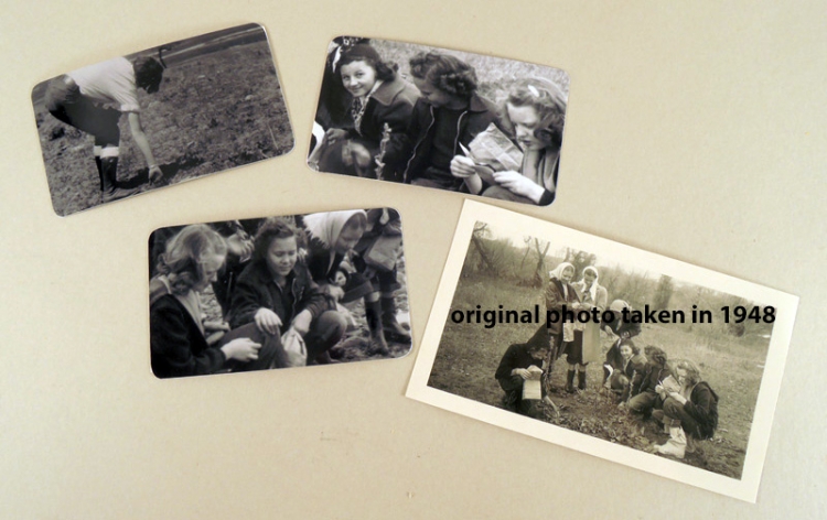
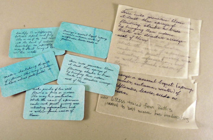
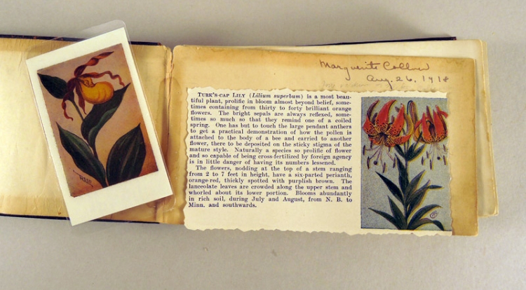
In 1920 my great aunt, Ruth Wheeler, was taking biology classes at the University of Kansas. Her drawings and notes were recorded in standard lab notebooks with pale blue covers, three holes punched along the left margin, each page with a printed pale blue margin. These were turned in, evaluated, returned to the students and, in the case of my aunt, saved in boxes, most likely seldom referred to or forgotten, until I came along and carried them back to my studio (with Ruth’s blessing) to join the manyl other boxes that form an archive of her life and work.


Some of the biology notebooks pages were used as prompts for collaboration when I was working with Spondere, but most of them remained quietly in my studio … waiting.


With it being 100 years later, 2020 seemed a good time to figure out a way to use more of these drawings. 2020 was an anxious time for many of us; for me things like doodling, coloring, tracing and so forth were useful tools to control anxiety. I camped quite a bit in summer of 2020, always accompanied by a box of various in progress projects, so I added the notebooks and a gel ink pen and began over inking the faint pencil marks of Ruth’s notes and drawings of frog dissections.


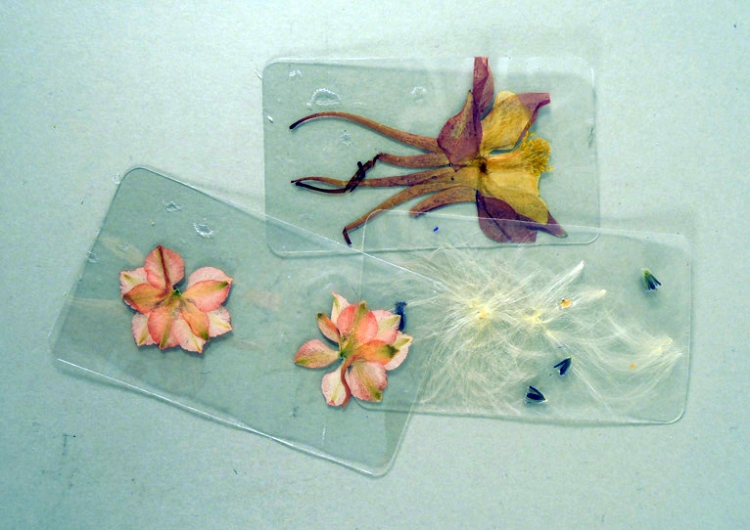
Back in the studio, I decided to paint some frogs over the biology pages using some images from books but mostly from the IUCN Red List of Endangered Species as visual source material. Still not sure where this was going, but suspecting it was going somewhere interesting, I treated all the biology pages with diluted PVA, which provides a lovely, transparent ground for ovepainting with oil. I selected 17 species of frogs from the Red List (based almost entirely on their looks) and spent many hours staving off anxiety by painting images of frogs.

SS Critically Endangered Panamanium Golden frog


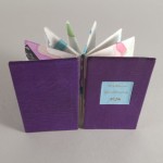
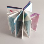
I further developed the idea of presenting these frogs, with details of their endangered state, in book form. I made a few models then settled on a wire-edge binding variation of rigid pages, diamond shaped with one side lopped off. The result is a book that, although very sturdy, is somewhat precarious when displayed open and upright.

Evanesco f


The images were scanned, then printed on hand-dyed Mohawk superfine text with archival inks on a Canon Pixma.

Evanesco g

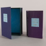
I included information about the distressing state of the many species of frogs that are listed on the Red List as endangered via handwriting in red ink the common name and Latin name of each species, along with its Red List status and population status (increasing/decreasing or stable). I also included a bar graph and pie chart that indicate the reasons for widespread extinction and endangered status of frogs worldwide. A summary of my own feelings about all this is summed up with words that appear on the corner blocks that hold the book in place in the box tray:


Blake believed that the object of being human is to learn how to be human. Will we learn to be human in time? To live up to our full capacities in time to save ourselves? To save the world that is vulnerable to us? To fail will bring on a greater tragedy than we can possibly imagine.


Evanesco a

I really enjoy painting on surface treated paper so I decided to hand paint labels for each of the 9 copies, plus labels for the spine and front cover of the drop spine box I designed to house the book. The covers of both the book and box are created using multiple layer of shellaced book board that is textured with acrylic modeling paste, painted with acrylic and finished with top coat of pigment mixed with cold wax medium, buffed to a soft sheen. I couldn’t find any book cloth of the right color so I airbrushed dilute acrylic onto some tan, paper backed Verona book cloth.


Evanesco h


Postscript

A copy of Evanesco: a selection of beleagured frogs was purchased by the British Library in 2022 and included in the 2023 Animals in Art exhibition and catalog at the British Library. The catalog entry, shown below, closes with this:

The dissemination of scientific knowledge can follow many routes. The success of Evanesco lies in its ability to distill current data into a visually engaging form that uses art to deliver its message. Though on the surface Evanesco can be seen as a sombre book, it also brings with it an element of hope by helping to raise awareness of the conservation issues faced by this group of animals. Every opportunity to bring these concerns to light is a positive step and, over time, could help these species recover.


British Library Animals  Evanesco page proof

Evanesco was also awarded the certificate of artistic excellence by the Puget Sound Book Artists and is held by University of Denver Special Collections, Colorado State University Special Collections, Emory University Special Collections.


Want to learn more about my studio work?


If you haven’t already, subscribe to my newsletter for occasional updates about my work in the studio. As well, please share this post if you know others who might enjoy it.


Posted on Leave a comment

Tile Paintings

This piece is available. Click here to purchase.

Tile Paintings as an altered book created from a book published by The Victoria & Albert Museum. The V&A Museum, established in 1852, is the world’s leading museum of art and design.

The museum’s opening followed the very successful Great Exhibition of 1851. Held in the purpose-built Crystal Palace and organized  by Henry Cole and Prince Albert, it was the first international exhibition of manufactured products. Its founding principle, and one which is followed to this day, was to make works of art available to all, to educate working people and to inspire British designers and manufacturers.

To this end, the V&A publishes about 30 books annually, working jointly with Penguin Random House and Thames and Hudson. In addition to promoting research, knowledge and enjoyment of the designed world, the publications generate profit for the museum. Current publications range from a charming children’s story by Jack Townend (A Story about Ducks $8US) to a Vivienne Westwood Opus Manifesto limited edition ($2700US).

The Colour Book series (published from 1985-1989) includes titles such as Decorative End Papers (1985), Patterns for Papers (1987), Japanese Stencils (1988), Novelty Fabrics (1988) and Ikats (1989). I have altered two books from this series, Tile Paintings (from Series 1 of the Colour books), and Indian Floral Patterns (also from Series 1). You can read my post about Indian Floral Patterns here.

The books are a lovely size to work with (8 x 5.5 x .5); each of the pages richly colored and most with little or no text. Tile Paintings piece is a pairing of the published book with four tile shards that were gifted to me years ago by a fellow scavenger.

Four shaped holes (roughly following the shape of the shards) have been cut through the cover and all of the pages; in the recesses rest the shards. The shards are protected when the book is closed with mica laminated in between the first end page and first few pages of the text block.

With a mix of PVA and methyl cellulose, I laminated several pages together, leaving me  with four double-page spreads to work with. Hundreds of paper cut outs in various shapes and sizes (the cut outs based on the recessed shapes using full-color reproductions taken from the book’s pages) are collaged onto the individual pages, obliterating the text.  Areas in between the collaged bits are  hand painted with gouache and acrylic inks. Although the book stays closed on its own, there is an additional magnetic/ribbon closure.

I typically create a utilitarian single tray, drop-spine box for my artists’ books; for Tile Paintings I stepped up from the strictly utilitarian and created a box with the same color-reproductions lining the inside.

Posted on Leave a comment

Wildflower Identification

From the Lovely and Amazing series, this limited edition book uses images, artifacts and writings from the archive of my great aunt, Ruth Wheeler. Ruth led a rich and varied life, passionate about both nature and teaching (she was a biologist with a teaching certificate). She had a big impact on how my views of the world were shaped. Creating my own works from that which she left me has brought me moments of joy and a bit of sadness too.

The general parameters of Wildflower Identification were partially set using the Ideation Deck (developed by Julie Chen and Barb Tetenbaum).

Cards I drew from the Ideation Deck were the starting point for this book.

Based on Hedi Kyle’s Blizzard Book (so called because Hedi developed the folded paper structure when a blizzard in Philadelphia kept her studio bound for a day), Wildflower Identification has 14 envelope pages created from one long sheet of Batik paper (imported from India).

I chose to work with this structure for a variety of reasons. The most obvious is my wish to present material non-linearly, allowing pages be removed and re-arranged. The content of the pages peeks out from that which contains them, reminiscent of plants peeking out, enticing a closer look. More obscurely, I chose this structure because it was developed by Hedi Kyle. I’m convinced that Hedi and Ruth would have enjoyed one another’s company had they ever met. Both have been role models for me. I am inspired by their excitement, curiosity and passion about their worlds, their lifelong willingness to share, educate and support those of us fortunate enough to have spent time with them.

Alicia Bailey and Hedi Kyle
Here I am with Hedi Kyle in Philly, 2013

The contents of the envelopes are cards, photographs or seed specimens adapted from Ruth’s archive. The three photographs are of teenage girls out on a seed and plant gathering adventure (taken on November 13, 1948),  scanned, cropped and re-printed.

Original photo and reprints

The cards duplicate Ruth’s handwriting and are taken from her many teaching files – these specific to teaching ‘her girls’ about plant identification and cultivation.

Tracing from original writings (right), finished cards (left).

Each book also contains three laminated seed and flower collections

Alicia Bailey Wildflower Identification post 04

and an original page from Chester A. Reed’s Flower Guide published in 1916, also laminated.

Page ready for laminating. Each book has a different original page from the 1916 book.

These, along with a title card (colophon on reverse) make up the contents of the book.

Some of the joys of designing and creating this book include time spent going through Ruth’s collections of photographs and writings, teaching my studio assistant Stefanie how to fold the pages (this is now one of her favorite activities and she has her own project in development utilizing the Blizzard Book), working with a rich, purple Nigerian goat (from Harmatan), a luscious and tactilely rewarding material, and making pastepaper for the project while listening to Western Bird Calls.

I used pastepapers inspired by Lucinda Carr for the text cards.

Note: several years ago, Lucinda Carr (invited me to her studio for a day of pastepaper production. Lucinda was producing and selling some fabulous paste papers and I was eager to learn her work methods. We set up and when it was time to go to work she said “This is my secret for making great paste papers – I listen to bird call identification recordings while I work”.

As I’ve worked with these materials, I’ve had not unpleasant moments of wistful sadness (sentimental nostalgia?). Some of this is related to missing Ruth but there is something else this material stirs up I me.

I’ve developed quite an attachment, crushes of a sort, to these girls (a few of whom are pictured again and again, on other outdoor, educational adventures, in Ruth’s photo albums), my emotional response based solely on impressions of who they may have been, these girls who so appreciated nature, whose curiosity and willingness to explore was endlessly nurtured by Ruth. I feel envious sometimes that I wasn’t one of “Ruthie’s girls” – many of them remained lifelong friends of Ruth’s and went on to nurture other young women throughout their own lives.

As I ruminate on the adventures Ruth’s archives document I feel a yearning to connect to my younger, more able-bodied, less educated self. I long to experience once again lovely stretches of time when activities such as of going out, alone or with others, to identify wildflowers the only mission aside from eating a picnic lunch in a wooded grove, perhaps near a running stream.

An archive of process materials is housed at University of Denver, Penrose Library, Special Collections.

Process materials for Wildflower Identification


Wildflower Identification is out of print.

Posted on Leave a comment

Testudines – a Lovely and Amazing box

Alicia Bailey testidunes WIP 003
Testudines is the order of reptile more commonly known as turtles, tortoises and terrapins. In addition to it being a great word (I have a fondness for multi-syllabic words with hard consonants in the middle), it is representative of a creature I was fascinated by as a child Alicia and turtle. I love this picture of me watching a snapping turtle in my aunt’s back yard.


Turtles appear in my dreams often; I rejoice when they do as I then wake refreshed and excited to face the day. 

Testudines are some of the most ancient reptiles alive. The ones my aunt kept in the back yard for a time were most likely snapping turtles, big, slow and a little big scary because of the hissing sound they made. They seemed to spend more time napping then snapping and feeding them was not nearly as exciting as feeding the snakes was.


I’ve been working on an assemblage with specimens from Ruth’s archives – Testudines Box. This box assemblage is the 3rd I’ve made using hardwood boxes that measure 12x6x7, two of the four corners curved rather than square.The two previous are Lepideptura Box and Bird Box.

L&A Lepideptura boxL&A Bird Box

To combat what I call ‘analysis paralysis’ when working with such a wealth of materials, I tend to develop a set of parameters for each series. For these boxes the parameters are:


1) specimen(s) from Ruth’s collection

2) photograph(s) of the lovely and amazing young women Ruth photographed

3) magnifying lens(es)

4) reproduction(s) of Ruth’s handwriting from her journals or teaching lessons

5) reproduction(s) of published materials used in her teaching


Testudines Box includes the shell of a Red Slider turtle along with the skull and jawbone of another Red Slider (this placed in a wooden box and magnified).

Alicia Bailey testidunes WIP 001
These artifacts are arranged in front of a color scan reproduction of the same turtle shell overlaid with mica.
Alicia Bailey testidunes WIP 002The interior box walls are lined with a repetition of an Emily Dickinson poem written out by Ruth in her journal, the exterior walls with instructions for digging out a laying of turtle eggs from one of Ruth’s many nature education books, an encyclopedia entry and images of turtle anatomy from various published nature studies.

Posted on Leave a comment

Rocky Mountain Creeper

rocky-mtn-creeper-front

Today I learn that the song of the Creeper is weak, colorless and sibilant. That  it consists of 4-8 notes, generally beginning with a long high-pitched note, followed by two short lower-pitched ones. The remaining notes vary somewhat, but are often a repitition of the first notes.

Creeper 

A common call note is a long, high-pitched “shreeeeee” with a rolling r-sound throughout. The bird also calls a rather faint ‘tsit’ over and over. These latter notes maya be heard at any season.


I also learn that the bird is easily identified by its habit have creeping continually up the rough bark of a tree in a spiral, then flying to the base of another tree to begin again.


I read nesting notes written by a W. C. Bradbury in 1918 (thanks to the folks at internetarchive.org) describing a foray in Gilpin County while on a White-tailed Ptarmigan and Brown-Capped Rosy Finch nest seeking mission. Their trip had the happy result of taking the first set of eggs of the Rocky Mountain Creeper taken in Colorado.


Armed with the vision of a small brown bird diving at the base of tree trunks, I begin to build an environment for the Creeper on a stick I have in my collection. I decide on a small shadow box.
 

WIP.LandA.Creeper_Box3


I can’t decide which side of my creeper I want all to see, a mirror box helps resolve that questions.

WIP.LandA.Creeper_Box1


I am charmed by Bradbury’s 1918 anecdote so decide to include it in the box.


WIP.LandA.Creeper_Box5


Conveying the feeling of lightness that birds so well express, is one thing I strive for.

WIP.LandA.Creeper_Box6


Here we go – all assembled, but hard to photograph with so many layers of reflective surfaces. 

Posted on Leave a comment

Bliss

Alicia Bailey WIP Bliss5

Each year the Morgan Conservatory in Cleveland, Ohio, sponsors a fundraising event called the Snail Mail Paper Trail. Artists are sent two sheets of handmade paper, made at the Morgan, and asked to create an artwork from one or both of the sheets. The artworks are then auctioned at the October Gala. I’ve been participating since 2009 (see Snail) and Yearning for Morgan.

Alicia Bailey WIP Bliss1

My two sheets of paper (one sheet each of white and dark gray cotton abaca blend) arrived at the studio on the same day I opened a set of Julie Chen and Barbara Tetenbaum’s Ideation Deck
IMG 0220
(if you don’t know about this wonderful tool for book related projects, you should . . . click here). I dealt the following cards, eliminating the paper category:
layout: in the form of a diagram, chart, or map
technique: high-tech (letterpress, offset, printmaking, etc
text: collaborate with writer or poet
image: none
Paper: provided
structure: innovative (tunnel book, magic wallet, carousel, flag book, etc.
color:single color
adjectives:
dissonant, traditional or historical, sculptural, impressionistic, poetic
Morgan 2013

The result is Bliss – an accordion fold book using a quote from Portia Masterson’s Bicycling Bliss.

Bliss is an enduring form of contentment derived from being fully present and practicing simplicity, moderation, self-nurture, reflection & conscious breathing.

Alicia Bailey WIP Bliss4

Granted the structure isn’t particularly innovative; I had originally thought this would be a tunnel book but had to redesign because the cut paper pages were too delicate.

After designing the pages in Adobe Illustrator,

Alicia Bailey WIP Bliss2the pages were lasercut

Alicia Bailey WIP Bliss3

and mounted between two translucent sheets of Japanese kozo paper, folded up as an accordion and cased in to a hard cover. Only one edge is attached, so the accordion will unfold to display the entire quote.

The book will be auctioned off at this years’ Annual Benefit and Silent Auction: Opposites Attract on October 5. There will be nearly 200 works from local, national and international artists; its worth a trip to Cleveland!

Posted on Leave a comment

Burning Me Open

Burning_Me_Open_edition_0001

I have had such a wonderful time working on this book. The project uses materials that are visually and texturally so rich they were a joy to work with.


There are 18 copies in the edition, plus one A/P. It measures 5 x 3 x 2 3/4 inches (closed) and weighs 24 ounces. It is priced at $540.


It takes the text and imagery from my 2009 artists’ book of the same title. I wrote the original text; the original illustrations were oil-paintings, re-created as line illustrations for this project.


The book pages are transparent, and thus allow sections of several pages to be viewed at once. The pages are rigid and thick, designed to display well both flat or upright. When displayed upright, lighting can be adjusted for increased interplay between the line illustrations and the shadows they cast.

Burning_Me_Open_edition_0006


text selection from the book:


there is one who touches me so it burns

my hands open

at their feeling of

the length of me


The materials:


Peltogyne (Purpleheart) is a tree native to Central and South America, growing in the tropical rainforests, This beautiful wood is a light brown when freshly cut that then shifts towards a deep reddish-violet as it is exposed more to UV rays. As a hardwood, it sands down to a smooth hard surface and once waxed feels wonderful to touch. Purpleheart is an exotic lumber, this batch acquired from a US company that insists its suppliers follow Responsible Forestry Practices.


Burning_Me_Open_edition_0005

Copper is one of my favorite metals and this book uses both copper leaf and thin copper tape of the sort used in stained glass. When the book is closed, it is possible to see down through several layers. A reality of working with transparent materials and text is that portions of the text will inevitably be reversed. This I find distracting so my solution for this book was to block the bottom inch or so of each page with an opaque (in this case copper leaf) material. I also needed something to help hold the pages together. I had first tried drilling holes in all 4 corners of each page and using copper wire as rivets but the task was fussy, time consuming with the end result visually dissatisfying.


The solution I settled on was creating shapes of copper leaf with PMA mounted on each side. The PMA faces the acrylic pages and holds them in place until the copper tape can be wrapped around the outer perimeter of each page.


How we did it:


The rigid pages that make up the text block are constructed of  several layers, a sandwich (from the bottom up) of etched cast acrylic, copper leaf with PMA on both sides facing outward and a second piece of etched acrylic. This creates pages that are 3/16 inch thick, their edges are sealed with copper tape.

WIP burning_me_open edition_0008WIP burning_me_open edition_0016WIP burning_me_open edition_0014


The covers were planed to 3/8 inch thick, the cover image laser etched in, the title area chiseled out, then sanded and waxed.

WIP burning_me_open edition_0021

WIP burning_me_open edition_0019
WIP burning_me_open edition_0006

WIP burning_me_open edition_0012

The recessed title label is laser printed copper leaf mounted on museum board.  The book is coptic sewn across the spine with dyed and waxed 4 ply linen thread, using yet another variation from Keith Smith’s well worn Sewing Single Sheets (Non-Adhesive Binding Volume IV).


WIP burning_me_open edition_0001


My thanks go to Shannon Perry, who created the illustrator files from a series of oil paintings I produced in 2007 and my studio assistants Stefanie Cornish and Jonathan Wiley. Without their help this project might still be in the idea stage


Copies of this book are available for purchase from Abecedarian Gallery.

Posted on Leave a comment

Hearts for Marcia – October 2, 2011

IMG_1202


My dad loved to make things. My dad loved my mom. He liked making things to tell her how much he loved her. Every year for many years, on Valentine’s Day, he made her a piece of jewelry with a heart motif.

hearts for marcia 2


I made a book that holds many of the hearts he made her.


IMG_1201


Most of the pages are made with wood I saved from his wood shop after he died. He used both cherry and poplar for instrument soundboards (his making of harpsichords as a vocation was started when he made another love gift for my mother – a harpsichord. That story is expanded on in my project Theia Mania). He planed down wooden planks to about 1/8 inch and edge joined them for the soundboards. He saved even the smallest bits of leftover materials, so when he died there were several lengths of soundboard scrap.


hearts for marcia 4hearts for marcia 3hearts for marcia 1


The wooden hearts he made from alderwood and ebony, again byproducts from the harpsichords. Many instrument makers buy pre-made keys but my dad made them himself. He shaped ebony, poplar and basswood for the keys; he also routed out the rosettes (of rosewood) that appear on the front edge of the keys. Some of the keyboards were reversed – the main keyboard (white keys) of ebony, the sharps and flats poplar.


To accommodate the thickness of the hearts, I suspended each heart with a length of thread in between two layers of wood with identical windows cut out (yes, I used the laser cutter for this, and to create the sewing holes in one step).

IMG_1203


He wasn’t a particularly innovative jewelry designer but had silversmithing skills and tools and often made simple pieces of jewelry, again for my mother. Committed to principles of re-purposing long before those principles reached the trendy status they now how, he melted down silver coins to create jewelry. Most of wood hearts were also wrapped with a silver braided wire, or had metal embedded into them.

IMG_1178


Later he started messing around more with epoxy resins and one of the last hearts he made is a swirl of color shaped into a heart.


I always enjoy these times of working with the same materials he used, often using the very tools he used. This book exemplifies the negative aspect of my  allegiance to finishing a book each week in that the level of craft is not up to the standard set by my father.


IMG_1204


This book measures 3 1/4 x 3 1/2 x 3 5/8 deep and has 9 pages, plus 2 covers

Posted on Leave a comment

Hair 2001

hair 2001.2hair 2001.4


A couple weeks ago I got my hair cut at a small salon in Grand County, Colorado.  On impulse i asked the owner if she would save me the hair clippings for a few days, which she did. So I thought I’d make a book called Grand Hair. Instead I made a book called Hair 2001.


Materials: Hair, obviously. Laseretched plexiglass, waxed Cocobolo wood, linen twine, copper foil, mica. Leftover shapes of copper leaf:

Burning_Me_Open_edition_0005


the last edition book, Burning Me Open, uses shapes of copper leaf applied with PMA to plexiglass. I mis-calculated and for every book an extra shape was cut out. I saved those extra shapes – eighteen 3×1 inch shapes of copper leaf all ready to put into a plexiglass page sandwich. Now what . . .

Mia Semingson Memorabilia

I decided to combine these two elements, copper foil & hair. Why? Copper is so beautiful and easy to work with. Hair is so creepy but tantalizing. A couple of years ago I saw a piece by Mia Semingson called Memorabilia” –  a fixed lid of clear plexiglass covers a box stuffed with her own hair; the box then case bound into a cover, the sides of the box covered with suede. This book of mine is quite different, but the thing Mia’s work inspired is the creation of a queasy feeling that comes with handling a box of human hair, even when the actual tactile experience is that of touching a very different feeling material – plexiglass.  So it is the thought of touching all that hair that is disturbing. On a strictly visual level, the hair in Memorobilia, made of countless layers of rich protein strands, is interesting and worthy of lengthy appaisal. In short, I appreciate both the visual effect and the queasy feeling interacting with her books creates.


hair 2001.5


The method of assembly and binding  I used with the Burning Me Open is a good fit. Using the PMA that is on the copper leaf to hold each of 2 plexiglass pieces together. Pictured right the foil is affixed to one side of the plexiglass. Bits of hair were put onto that surface, the release paper pulled off and the other piece of plexi placed on top. The edges are then taped together with copper foil.


hair 2001.1

I have had this silly book –  The History of Hair . . . An Illustrated Review of Hair Fashions for Men Throughout the Ages –  for many years. Published in 1960 it includes a chapter called Look Into My Crystal Ball (The Twentieth Century). The text for my book Hair 2001, is taken directly from that chapter.

Hair 2001.8


Here are some predictions (paraphrased), the authors made for the year 2001:

According to Coiffure Masculine, by 2001 75% of the male population will be wearing wigs.

Not, however, to conceal baldness, but as fashion accessories.

These wigs will not be a camouflage for natural hair.

On the contrary, they will be worn with great personal pride.

Wigs for different occasions will appear on the fashion scene

Wigs for work. Wigs for dancing. Wigs for dress.

It is predicted that by the year 2001, baldness will be obsolete.

hair 2001.6

These predictions I’ve prefaced with the questions, also paraphrased from the book:

By the year 2001, will a lunar hippie protest by means of a closely-shaved scalp?

A balding Astro flash a pair of false eyebrows to offset a full magnetic wig?


hair 2001.3

hair 2001.7

The 6 rigid pages consist of laseretch plexiglass, hair, copper foil and copper tape, bound in a variation of an across the spine coptic style first introduced to me by Keith Smith and found in his book Smith’s Sewing Single Sheets. They are sewn with heavyweight linen twine. The covers are of Cocobolo wood that I get from Bell Forest Products. This is a wood that is too oily to glue well, but for sewn on covers it works very well. Those same oily properties means this wood polishes beautifully. The covers of Hair 2001 are waxed – smooth and silky to the touch.

As an aside, Cocobolo wood also has a strong odor, a very pleasant tangy floral order, sort of like my shampoo. The front cover has a window cut out, into which a sandwich of mica, plexiglass and hair is inset.

I am well pleased with this book. The size (The book measures 3 1/2 x 3 1/4 x 1 5/8 closed) and weight of it feel good in the hands. It is visually enticing and well constructed. The content makes me chuckle.

Posted on Leave a comment

Yearning for Morgan

Yearning for Morgan1

Yearning for Morgan2


Coming up in October is the fourth Annual Fundraising Auction at the  Morgan Paper Conservatory in Cleveland, OH. Each year they invite artists to create a piece using paper made at the Morgan. This year is the second time I’ve participated in this fundraiser – The Snail Mail Paper Trail. Snail Mail because they mail sheets of paper to any artist who wants to participate. Paper from the Morgan is a treat to work with – they know how to make paper at the Morgan! This year I received 3 sheets, in two different tones.


The first one I sent, last year, is blogged about here.


This year I created a book utilizing an alphabet I created several years ago – the alphabet is pictograph based, rather than phonetic. I like to think of it as a good general purpose alphabet and is  always expanding in that I’m always creating new elements for this alphabet. So it is an unfinished alphabet, or rather a work in progress.


Yearning for Morgan5


The title, Yearning for Morgan, operates on more than one level. It is literal – a selection of yearning alphabet symbols presented in a book created for the Morgan. But also, when I think about places like the Morgan, places I imagine to be rich with ongoing projects, like-minded artists working during residencies, workshops and exhibitions, I am filled with a yearning to be in one of those places. Denver doesn’t have such a place. This goes even deeper; at times, I yearn for a different life.


And, buried even more deeply, is my yearning for my old Morgan mare, Reba. Reba was the last horse I owned and I sold her several years ago. She was a great horse, and I always assumed I’d get another Morgan mare sometime but I haven’t yet and now that I’m living in a city again, I probably won’t. Recently I decided to sell my old saddle and tack, but haven’t gotten around to it. I still have tack, and old gymkhana ribbons dating back to my very first horse, the horse I got in 1969 – 42 years ago. Maybe I’m just yearning for my life to be a little bit different. To be filled with a promise and excitement that is a little elusive in middle-age.


Yearning for Morgan4


Yearning for Morgan3


Back to Yearning for Morgan, this book was made by cutting the characters out of one of the cooler toned sheets of paper (using a laseretcher) and mounting those pages to folios made from the warmer toned sheets of paper. Underneath each character is the name I’ve linked to the character. The book is bound in a millimeter style binding with paper covered board covers and calfskin spine. The cover title, title page and colophon are laser transfer. It measurers 5 1/2 inches by 4 1/8 by 3/8 inches. And I also want to mention that the characters I use for laseretching were converted to EPS so they can be read by the laseretcher by my friend & Adobe Illustrator genius Shannon Perry.


Yearning for Morgan6