Posted on Leave a comment

Tongue Tied

Tongue Tied_0175This post comes at the request of a special collections librarian, curious about the use of wax (problematic in its stickiness and fragility) on the lid and base of this book’s container. The material use of Tongue Tied is an excellent example of material selection bearing close relationship to project content/concept.

Tongue Tied is based on a poem by Patricia Beers, a disturbing poem describing the almost unbearable results of a lifetime of keeping silent.

The subject matter is a painful one. One reaction to pain is what I think of as ‘fear biting’ – holding others at bay because to allow closeness invites pain. To get physically close to this text isn’t impossible but does require caution as it, and the box it is housed in, have the sharp end of nails sticking out.
Tongue Tied_0172

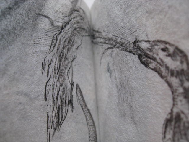
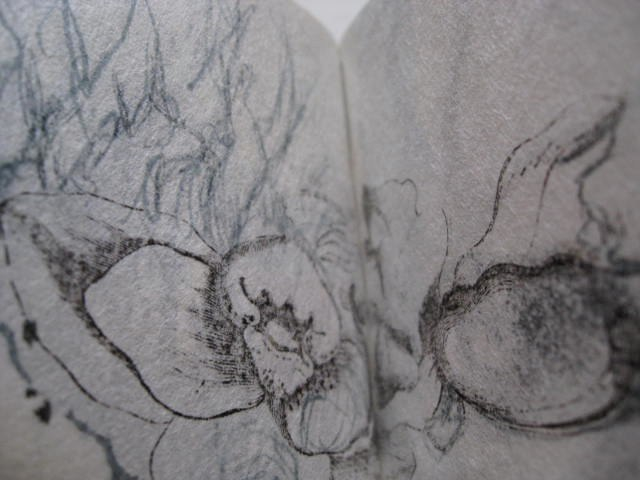
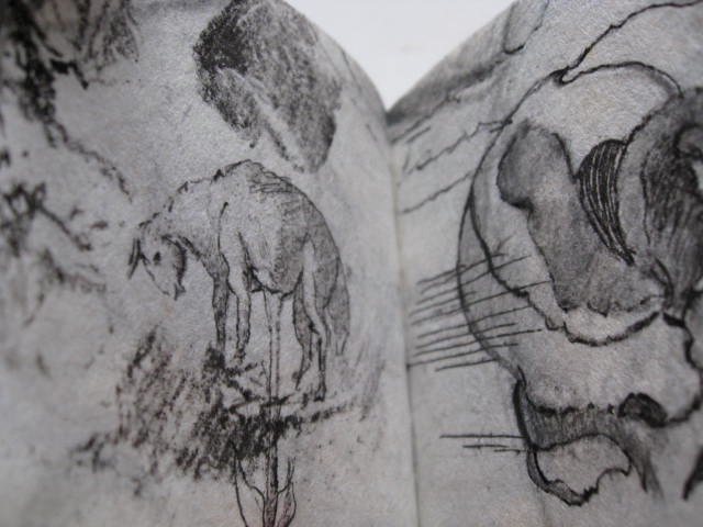
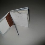
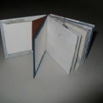
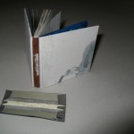
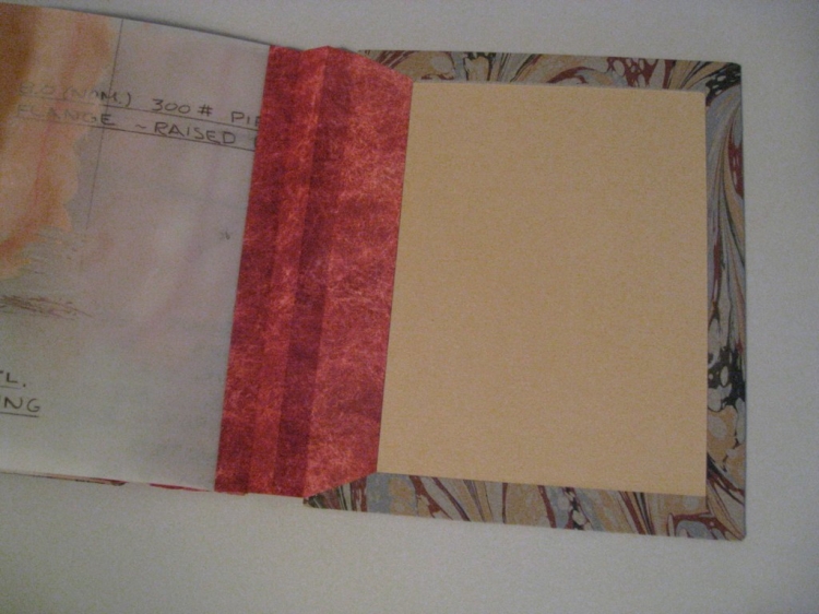
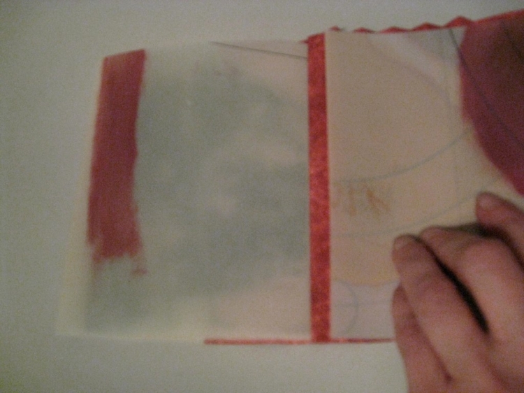
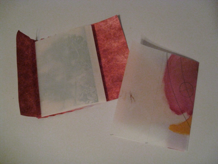
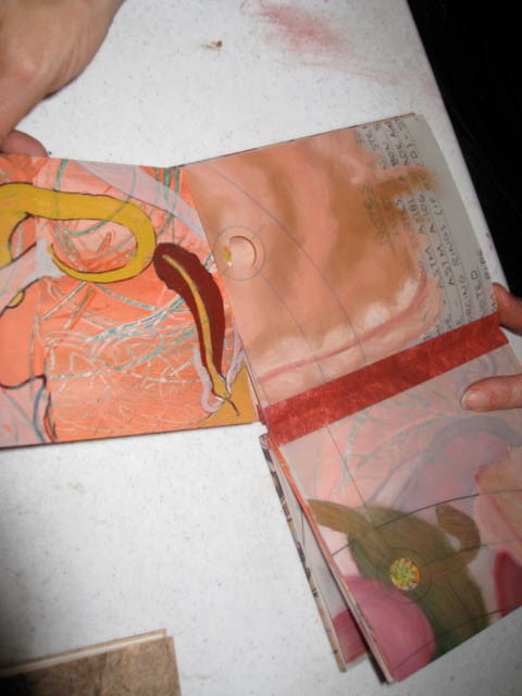
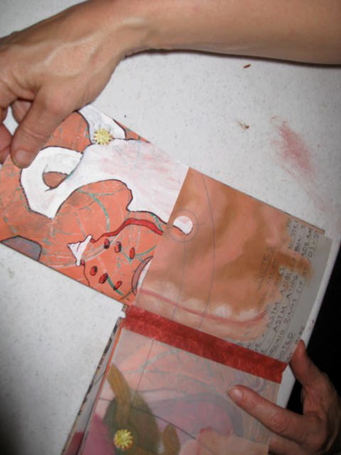
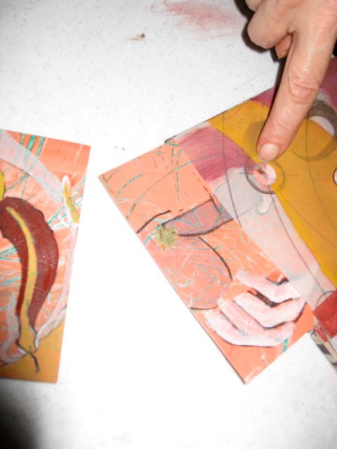
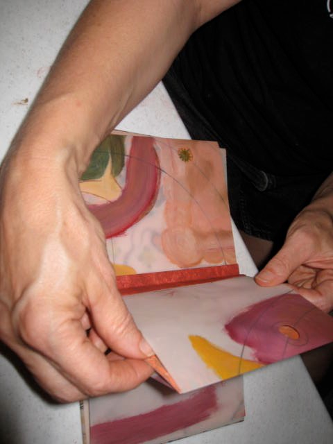
When one is silent, others have to to dig and pry to find out more. Some of the text is hidden beneath images that need to be lifted to be read, other texts have incomplete letter forms (accomplished by using an asian lace paper), making passages difficult, but not impossible to read.

Tongue Tied_0174Another panel lifts to hold part of a broken and smashed thimble. This obvious use of artifact links to the text line ‘whatever silenced me when young has put a thimble on my tongue’. Tongue Tied detailAnother panel lifts to expose the narrow shape I use to depict a scar, this one has stitching implying the wound is held closed, but barely.

A less obvious relationship of material to content is the use of a plasticized Wyndstone paper that reminds me of commercial floor linoleum. Here is the back story behind that selection:Tongue Tied_0177

When I was in elementary school, one of my favorite classes was science. The teacher, Miss Koury, was big boned and focused, quite often the butt of jokes I didn’t then understand. She brooked no nonsense. Typically there would be a lecture, a demonstration and then we would line up to gather materials for our assignments. I was a well-behaved child for the most part, and didn’t get in trouble for talking in other classes. But in Miss Koury’s class, wild with enthusiasm, I was frequently reprimanded for talking while waiting in line.

My punishment was to be locked in the storage closet during the best part of the class. The closet had a commercial linoleum much like the Wyndstone paper. I was silenced. My love of learning had to live side by side with a fear of being punished for displaying joy at the process. I spent the rest of my school life avoiding science classes. When I saw this Wyndstone paper at an art supply store, I was stricken by something I couldn’t then identify or articulate. I bought it not knowing why soon after I brought the paper to the studio I found this poem and began designing this book.

Tongue Tied_0173The book is contained in a black mesh box, the mesh walls held in place with galvanized nails, at the same time the mesh wraps around the outside of the nails; additional stitching helps hold everything in place. The use of ‘galvanized’ material is relevant. One definition is to shock or excite someone into taking action, the other to coat iron or steel with a protective layer of zinc. I leave you to reason why I chose these particular nails for the box.

Tongue Tied_0171Both the base and lid to the box are painted black, and then overcoated with a beeswax/damar mix that has been pigmented with dry charcoal. The result it a semi-hard surface that remains sticky, attracting bits of dirt and dust, adding another layer of the fear-biting concept to this work. Emphasizing duality by enticing one to come closer and then imposing risk of harm when one does come closer is a hallmark of some of my more succesful pieces.

Tongue Tied is held in several public and special collections including University of Colorado, Norlin Library, University of Utah Marriot Library, University of Denver Penrose Library, University of Idaho, Savannah College of Art and Design and Oberline University. A few copies remain and can be purchased by contacting any of my dealers: Abecedarian Gallery, 23 Sandy Gallery, Vamp and Tramp Booksellers.
Tongue Tied_0176

Posted on

Cosmeceutical Collection

cosmeceutical collection.jpg

This collection was designed in 2006, and the first copies produced that year. It is in the Alan Chasanoff collection, and in Special Collections at the Topeka County Public Library, Emory University, Scripps College, University of Washington, University of Miami and University of Denver. The archives are also held at University of Denver.  It was reviewed as part of Emory University’s Artists Book Showcase; read that review here.

Rather than completing the production all at once, I produced copies in response to orders, and this is one instance where procrastination was of tremendous value. Knowing more now than I did when the boxed set was designed and having access to different tools has benefitted the production process and end quality of the piece.

The set combines three of my miniature books (Belladonna, Compact Beauty and Lashlure), books that use cosmetic cases as containers, in a custom made box.

Production of the miniatures may be the focus of another blog entry – here I am concentrating on the box itself. Here is what the individual books look like:

belladonna 2

lash lure open

compact beauty

The box tray has 3 recessed areas, each of different size, shape and depth, for each of the miniature books.

IMG_0472_0173


I considered using wood and having the recessions routed out, and also considered laminating individually cut pieces of thinner material, such as Davy board to make the base. I eventually settled on a product called Balsa Foam.

WIP Cosmeceutical Collection

Starting with sheets of 9x12x1 inch Balsa Foam, I cut them each in half using 2 partial cuts with a power miter saw.


WIP Cosmeceutical Collection

I then used a drawing template to mark the surface for the interior cut outs.


IMG_0467_0168


IMG_0468_0169


IMG_0469_0170

These were then cut out with a power scroll saw, after first drilling holes in the cut out areas for insertion of saw blade. Balsa Foam is a handy product but I don’t plan to use it again. The dust generated by manipulating it is no doubt toxic and, even though I used the denser of the two grades it is subject to cracking and breaking.

Each recessed area requires a different depth so platforms for Belladonna and Lashlure are cut from museum board and inserted them into the appropriate area, holding them to the correct height by shimmng them from underneath with built up pieces of foam core. Compact Beauty does not require a platform.

IMG_0471_0172

After the tray is shaped, it is sealed on all sides with acrylic polymer. This helps contain the dust and lessens the absorption rate. Pared down leather is used to line each recess sides and bottom. The top surface gets a second coat of thicker polymer (a gel medium) that shows texture, then is painted with two layered colors of acrylic paint. The top layer is an ‘interference’ pigment so has a subtle sparkle to it, similar to that of many cosmetic products.

IMG_0473_0174

Pink leather (from Harmatan) is laminated to 2 play museum board, then trimmed to strips the length of the box sides by the tray height plus 1/8 inch. After the edges are painted with liquid acrylic ink, they are attached to the tray box sides.

There isn’t anything out of the ordinary in the production of the box’s outer shell. Prior to gluing the tray into the shell, a ribbon is run across the underside of the case between the recesses for Belladonna and Compact Beauty – the ribbon comes up into the tray and makes removing the books from the recesses much easier. Lashlure doesn’t require a ribbon.

IMG_0474_0175

cosmeceutical closed.jpg

The case has a pink leather spine, the paper coverings are Mohawk Superfine Text laserprinted and then overpainted with a mixture of acrylic (pink again!) and methylcellulose. This is a necessary step to seal the transfer toner, which otherwise will flake off. Prior to this step, laser foil is affixed to the title portion of the text on the container lid.

Posted on Leave a comment

Boston – Sept 19, 1901, October 15, 1901

This book was recently purchased by the Boston Atheneauma membership library thatfirst opened its doors in 1807. I am well pleased by this placement, facilitated by Vamp and Tramp Booksellers, who carry other unique and limited edition works of mine.

The book was created from glass plate negatives made by my great-great-grandfather George Carpenter Wheeler in 1901. The negatives ere made between September 19 and October 15 of that year and are of public areas in the Boston area. 9_19 & 10_5 -1901 bookc.jpg
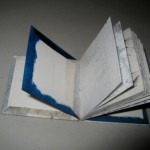
I scanned both the negatives and the disintegrating envelopes they were stored in, and printed them via both ink & laserjet. The negatives and prints from the scans are bound wire-edge style.
Comes in custom box of wood, bookcloth & book board. glass plate negatives, inkjet prints, brass, book cloth, paper, book board, in custom box9_19 & 10_5 -1901 booka.jpg

I have more of these negatives and plan to create a similar book from them. I will photograph, post and describe the steps taken during the construction of the second book. But for now, I have only photos of the finished work to show you here.

9_19-&-10_5-1901-booke.jpg9_19 & 10_5 -1901 bookb.jpg

Posted on Leave a comment

Snail – class Gastropoda

IMG_1343To celebrate their upcoming one-year anniversary the Morgan Conservatory, a paper and book arts center in Cleveland, OH sent me two sheets of their handmade paper with the request that I make a piece — the instruction was simply to ‘to as you like incorporating the paper provided.’
WIP Snail 5
Each sheet of the 12×22 inch paper is gray but of slightly different values. The fundraiser is called the Snail Mail Paper Trail so I made a book called Snail class Gastropoda, and decided on a meander book structure. Meander books are easily made from one sheet of paper, but I opted to create panels and stitch the panels together rather than using a fold.


Using a large punch with a spiral pattern, I cut some spirals out of the lighter toned paper, then hand cut some freeform shapes resembling snail trails keeping the cut outs to use in the box. I then laminated the sheets together, and cut the laminated sheets into 8 square panels, each about six inches square.

IMG_1337

To minimize the problem of thread tearing the pages at the joints, I cut some mica washers in half, glued them to the paper edges and sewed through both the mica and the paper at each sewing station. I used lightly waxed linen thread and opted to leave the tails of each thread dangling. The text, a piece I wrote using found poetry techniques with Wikipedia as the original source, is laser transfer.


Snail class Gastropoda


found in ditches, deserts, the abyssal depths of the sea.


snails with a gill can be found on land


snails with a lung found in water


gliding along on a muscular foot


covered with epithelial cilia


waves of contractions


move down the ventral.


they walk over razors


a layer of tissue covers the visceral mass


snails need calcium


(the operculum of some has a pleasant scent when burned = incense)


most bear tentacles on their heads


eyes carried on the upper stalks


lower set olfactory


a snail breaks food using radula


chitinous structure microscopic hooks cuticulae


in a quiet setting, a snail can be heard crunching


radula tearing, eating.


the snail grows, so does its shell


secreted material added to the edge


the center of the shell’s spiral made when the snail was young


hermaphrodites


snails perform a ritual courtship


inseminate each other


each brood +/- 100


snails need calcium


eat the egg from which they hatched


cannibalization by babies of other eggs (even unhatched) has been recorded


The paintings of snails are watercolor/gouache. Each page was coated with conservator’s wax after transferring/imaging.IMG_1334
IMG_1339

As much as possible I like for my work to include artifacts that have a relationship to the piece, in this case snails. I used a wooden frame with recessed plastic glazing for the box walls. I filled the recessed area with sand and snail shells, covered the plastic with a layer of very thin and translucent Japanese paper, laid in the cut shell and snail trail shapes I’d earlier cut out from the handmade paper, then added another layer of the thin Japanese paper.
IMG_1338The inside of the box walls are covered with gray moriki paper, the outside and top edge of the box walls with multiple layers of Thai unryu. The tray was then affixed to fabric and paper covered book board. A ribbon pull makes it easy to pull the book out of the tray without damage. The box label is laser-transfer.

Technorati Tags: , , , , , ,


Posted on Leave a comment

A Little Book of Drawings


A Little Book of Drawings

I have, in my adult life, moved literally tons of objects from place to place. The decision of whether to keep or discard is ongoing and I fear my elder life will be ruled by objects, much in the way of my parents. This I find disturbing and I continuously work to rid myself of objects using criteria that varies hugely from year to year.

Some collections, such as art books, don’t come under scrutiny too often. The music collection morphs into another version of itself (records replaced by audio cassettes, those replaced by CDs and those transformed into MP3 recordings). It makes sense to keep studio materials even though my emphasis in the studio and thus material use has shifted course many times over the years.

One area I haven’t figured out how to manage is the mass of unfinished, unsold, unframed artworks. Somehow simply throwing them away doesn’t seem an option, and I don’t really consider giving them away either. Re-purposing is a favorite strategy; a project with a layer already rich with pigment and potential a rewarding way to spend some time.


This week I made A Little Book of Drawings (measures about 3x3x.5 inches). I started with old figure drawings on mulberry paper, cut them up and ordered them into signatures. Both before and after sewing the text block, I further worked the drawings with ink and some transfers. The signatures were sewn with a supported link stitch and hollow back cased in with a variation of a split board (or tongue and groove) technique. The book has a leather spine and handwritten title.

Above are some photos that show the various binding steps: the brown paper is a moriki that is attached to the hollow tube and then extends, creating the tabs (tongues) used to attach the covers. The white material with blue edges is 2 ply museum board used for the inner board (rather than actually splitting a board, 2 boards create the ‘groove’ where the tongue is glued in). The end sheets are then pasted down leaving a hint of the blue exposed. And, as you can see from the leather spine, I didn’t get it right the first time, had to detach and re-attach the leather. Fortunately I use paste with leather so re-doing the spine didn’t ruin the book.  I am pleased with this book. It has a richness last week’s project did not; has evidence of my history as a mark maker, evidence of passable skills at binding small books. As I ponder this book, I decide that part of its success lies in the various qualities inherent in the materials themselves. Mulberry paper, graphite, ink, thread and leather.

Posted on Leave a comment

From This Place

I unabashedly join the ranks of mixed-media artists who hoard. My studio building is twice the size of my house and about 30% of that space is devoted to storage. Time spent rummaging in the ‘ingredient archives’ can bring on bouts of contented assessing and re-arranging, frustration at not finding what I seek and glee when something clicks into place as the obvious choice of object to solve a problem.


For book of the week projects I avoid purchase of new materials, and thus far have found what I need in the archives. This week’s project re-uses the unbound pages from a previous limited edition miniature book that I wasn’t pleased with and abandoned. Why I assume I can take these failed pages and rework them into something more successful is a mystery but that was the intent of From this Place.

IMG_1157The text of the book touches on containment versus abandon, with hints of discretion and privacy. A screen structure seems a good fit here. I have had in my studio for a long time an object whose intended use is eludes me – it could be a prototype for a full size screen, or something intended to block a portion of a desk from view. I am imaginative and still cannot come up with a function for this object. I would assume it a wall hanging but there is no way to hang it.

It is a simple construction, hinged plastic panels are bound at top and bottom with strips of continuous cloth.

For my project, I cut out and re-ordered the failed image pages (which are color laserprints, each about 2.5 x1.5), laserprinted the text on transparent sheets, and using double-sided PMA adhered the text to the image. Another layer of PMA, this time extending beyond the image, then a layer of mica. With an image on either side of each panel the layer, top to bottom is this: mica, PMA, transparency, PMA, image/glue/image, PMA, transparency, PMA, mica. These panels are ‘bound’ with a strip of acrylic tinted tyvek along the top and bottom edge. Another strip of tyvek is at either edge more as a visual than a structural device. IMG_1163

IMG_1159

IMG_1158


Posted on Leave a comment

Albinus

Dr Albinus

For whatever reason I have amassed a collection of anatomy books; IMG_1109one of my prize possessions being an out of print source book called Images of Medicine. Less prized (perhaps because it is a readily available and inexpensive Dover edition) is a copy of Albinus on Anatomy, a Dover book with 80 original Albinus plates, an account of Albinus’ work and a summary of the original preface to the 1747 edition of Tabulae Sceleti et Musculorum Corporis Humani. His preface described in great detail his work methods, problems he encountered and reasons for adopting the methods that he used.


Using the same structure as last week’s Picture Book, I created sleeves from a lighter weight translucent mylar. Although the quality of increased transparency was the reason behind the decision to use the lighter weight product, I found it wasn’t rigid enough to hold the inserted images in place with friction.


WIP Dr Albinus 6

This is one of many examples of the inability of materials to mimic the vision in my mind. Solving these problems with attentiveness to the original concept can make a book’s content visually richer. On the other hand, it is easy to overcomplicate, to rely on a formulaic bag of tricks that don’t necessarily fit the project but are familiar and efficient. My solution here has elements of both – I hand stitched the tops and bottoms closed. The translucent sleeves hold two cropped reproductions of drawings from Albinus on Anatomy, back to back and printed on a commercial paper called vellum. Thus some of the reproductions on one side are visible through the other side, but only in a few areas and only when one puts pressure on that area of the sleeve.


WIP Dr Albinus 7


Other than the brief introduction, which is a summary from various sources of information about Albinus All of these images and direct quotes are from Albinus on Anatomy by Robert Beverly Hale & Terence Coyle published from original Albinus plates by Watson-Guptill Publications in 1970 reprinted by Dover Editions in 1988.


I selected the text which was laser printed on another commercial paper with a peach toned mottled surface, using a font based on DaVinci’s handwriting. The text pages were laminated back to back to make stiff leaf pages which were inserted into the concertina’s pleats, as were the images in their vellum sleeves. The book has a total of 6 rigid pages and 3 vellum sleeve pages. All was proceeding well other than the inadvertent inclusion of an extra spine pleat (haste makes waste and all that).


Dr Albinus


This I didn’t notice until the book was cased into the cover (with tabs of spine tyvek inserted in between the museum board cover board and the elephant hide cover paper, split board style), the pastepaper endsheets in place. It wasn’t until I took the book out of the press that it became clear that the back end had an extra pleat. So every time the book is opened and examined, it doesn’t fold up properly. Nothing to be done at this point except finish it up as is. Studio practice for this book, as for most of mine, doesn’t make it easy to disassemble the book but I do plan to re-work the ordering of the text and images in the creation of a very similar book as it works on many levels.


The book’s cover label is an inkjet print from another of my favorite books, the Encyclopedia Anatomica. A Complete Collection of Anatomical Waxes an astounding survey, magically photographed, of the collection of “wax” figures created (and still on display) at the Imperial Regio Museo di Fisica e Storia Naturale in 1775. Every single part of the human anatomy was cast in a somewhat mysterious process and the resulting ‘wax’ bodies, all either life sized or larger, were then arranged in remarkable artistic dioramas, some called “death,” “the triumph of time,” ‘the plague,” “syphilis,” etc. Then each part of the body was also displayed individually so one can see here brains, hearts, testicles, penises, ovaries, eyeballs, veins, skulls, wombs, fetus (in all stages of growth), babies, old people, dead bodies, decaying bodies, etc.

Technorati Tags: ,

Posted on Leave a comment

Picture Book

Alicia Bailey - Picture Book


I find it difficult to make books without words, although I appreciate both impulse and outcome in the work of others and in my own mind. I suspect I rely too much on words to impose structure and to obscure any lack of stand-alone brilliance my images may have. So, for this book I use no words other than the handwritten text on the re-purposed drafting mylar used in the book.

With only a few hours for this project, I decided to use pages already imaged from a previous project. I cut up a sheet of drafting mylar that I’d intended painted and intended to use in an earlier book.

I enjoyed making this picture book. Without having to be concerned with issues of text (selection/editing/layout) I was able to enjoy other aspects. With ordering a different issue than it is with text, I opted for a page format that allows the images to be re-arranged.

The images are placed in translucent sleeves, easily removed but held in place by friction. Holes punched in the mylar, with foil shapes behind provide a guide for the ordering and placement I decided on.

The book spine is a concertina of tinted tyvek. The mylar sleeves are sandwiched between two  pleats; each page has an additional spacer pleat in between. The tyvek extends beyond the spine and is used to attach the covers.

When working with tyvek I to use double stick tape or PMA if I can as tyvek isn’t absorbent enough for most liquid adhesives. Heat activated adhesives will melt the tyvek. The covers of this book feature hand-marbled paper from Pamela Smith. The front cover has a recessed circular label with an image from the Jouissance series.

Posted on Leave a comment

Euxoa Auxiliaris

Its one of those summer seasons when the Miller moths are abundant. It makes me think of the 2002 exhibition “The Miller Family Story” by Sandy Lane (see photo). For her series Lane used the aggravating presence of Miller moths in her home and studio as a catalyst to a body of work that included painstakingly painted and mounted months recessed into cut away areas of her paintings.

lane-moth.jpg


IMG_1085


My project was triggered by a moth who landed on the wide expanse of PVA in an open gluepot and become mired but not submerged. I removed it and slid it onto a circle of mica. The combination of moth/mica/circle became the dominant element in the book Euxoa Auxiliaris.

To begin, I collected death moths from around my studio, some with wings folded, others with wings more outspread. I stuck them with insect pins to a piece of foam core and coated them liberally with Rhoplex (which is similar to an acrylic gloss medium). I scanned and printed an antique sheet of various types of moths onto a lightweight textweight paper and found some two inch clear circular boxes. After determining a page size, I cut 4 pieces of poplar wood to the final page dimension and drilled a 2 inch hole in each. IMG_1089

Each wooden page is covered with some scrap from Cave Paper. On one side of each page the circle cut out is left exposed, on the other side it is covered with a lightweight board to which the inkjet moth images are laminated. Before mounting onto the wooden page, the inkjet print is protected with a sheet of mica. Using wet adhesives with mica doesn’t work well because it isn’t porous; contact adhesives aren’t transparent enough. So I use a PMA two-sided film to laminate the mica to the inkjet prints.

IMG_1087

The moths are arranged and glued with PVA to the mica, the clear box placed over them and glued into place. A paste made of ebony sawdust and Rhoplex is used to fill the gap between the wood and plastic. The text block is held together with a variation of what I call the Mongolian Binding, a rigid page binding technique that works well with thick pages. I saw a variation of this used on a book by Jana Sim at Abecedarian Gallery called My Doors (see picture). my_doors_1.jpg

The tapes for Jana’s book are leather; I used laminated bookcloth instead as I wanted less bulky tapes.

WIP Euxoa Auxiliaris 9WIP Euxoa Auxiliaris 10 The covers are book board covered with lightweight Nepalese paper on which on image of a swarm of Miller moths is printed. The circular title label is recessed into the front cover board, printed on paper and protected with a sheet of mica. The text is laserprint transferred to each page. On the outside pages, black and white laser printed images are transferred to the top, bottom and fore-edge pages of the text block.

Above details the structure and handling of materials. Now here is a bit about how the text and other content of the book was developed. I started reading about the moths that I’ve always referred to as Miller moths. Using the information I found about these predictably fascinating pests I wrote a snippet less scientific than the sources I used, along with a second snippet consisting only of a string of words, the two writings kept separate by use of different typefaces and placement. The text for the book follows:

Like the dusty flour covering a miller’s garb, wings covered with fine scales easily displaced, eyes, pale colored, reflect light, appear to glow.

In army-like groups they crawl across fields or highways, migrating towards the mountains.

Sleeping by day, they awake at dusk. Thinking all light is the moonlight they use to guide their nocturnal journeys westward, artificial lights confuse their insect response.

During this moist year, they have lingered here, flapping about in my cold coffee, or taking a fatal dip in an open glue pot.

Spiraling to the source a moth to flame

EuxoaAuxiliarisdetail2

The book measures 3.5×2.5×2.25 inches and was finished on July 5, 2009

WIP Euxoa Auxiliaris 6

Posted on Leave a comment

That Milksnake Story

Alicia Bailey -That Milksnake Story
Alicia Baliey-That Milksnake Story

I have some beautiful papers from Cave Paper that they call “skins” – it is translucent and crackly, a good fit for the inclusion of snakeskins, which I also have a supply of and a fondness for. There is a single sheet structure that I have seen referred to as a maze or a meander book but the reference I like most (and that I can’t find now that I’m looking) is a snake book (I think Scott McCarney calls it this). An obvious structure choice for this book. –

Another trigger was a book I had in the studio Reptile Medicine and Surgery by Douglas R. Mader with beautiful reproductions of reptile anatomy.

Alicia Bailey - That Milksnake Story 3

After folding and cutting the paper, I painted with gouache on both front and backsides. I have lately been using a writing technique similar to those used for found poetry. My texts do not necessarily conform to poetic form but the guidelines are similar. Text on the frontside was created from an article published in the July 3, 1930 Walnut Grove Tribune – a bit of folklore (what might today be called an urban myth) about the milksnake.


That Milk Snake Story In the pine barrens I caught a large snake black-and-white serpent immune to the bite of any The sight started a line of snake stories. A cow that suddenly went dry watched, she would go to the far pasture low invitingly A snake would creep out of the grass milk her. When the snake was killed quarts of milk gushed out. The cow pined away and died. A sad story; true as most.

On the backside is a text written from various encyclopedia entries, again, using found poetry methods. I digitally formated my writings to fit this book then laser transferred it to the bookpages.

The oviparous milksnake whose clutches average ten starts with three, or four or even twenty more in humus or under rot eight weeks later the precocial young need precious little more (brightly born they dull with maturity) even the largest of milk snakes could no more milk a cow than could a bird

For the cover I sandwiched some snakeskin bits in between 2 circles of mica and, because the mica is transparent, it is possible to see through the mica to the image painted on the first page of the book.


The book when closed measures 7x6x3/4 inches, and extends open to 7×22 inches.

This final images shows the page orientation etc. of the book, and that it remains really, a one sheet structure.

Technorati Tags: