Posted on Leave a comment

Hair 2001

hair 2001.2hair 2001.4


A couple weeks ago I got my hair cut at a small salon in Grand County, Colorado.  On impulse i asked the owner if she would save me the hair clippings for a few days, which she did. So I thought I’d make a book called Grand Hair. Instead I made a book called Hair 2001.


Materials: Hair, obviously. Laseretched plexiglass, waxed Cocobolo wood, linen twine, copper foil, mica. Leftover shapes of copper leaf:

Burning_Me_Open_edition_0005


the last edition book, Burning Me Open, uses shapes of copper leaf applied with PMA to plexiglass. I mis-calculated and for every book an extra shape was cut out. I saved those extra shapes – eighteen 3×1 inch shapes of copper leaf all ready to put into a plexiglass page sandwich. Now what . . .

Mia Semingson Memorabilia

I decided to combine these two elements, copper foil & hair. Why? Copper is so beautiful and easy to work with. Hair is so creepy but tantalizing. A couple of years ago I saw a piece by Mia Semingson called Memorabilia” –  a fixed lid of clear plexiglass covers a box stuffed with her own hair; the box then case bound into a cover, the sides of the box covered with suede. This book of mine is quite different, but the thing Mia’s work inspired is the creation of a queasy feeling that comes with handling a box of human hair, even when the actual tactile experience is that of touching a very different feeling material – plexiglass.  So it is the thought of touching all that hair that is disturbing. On a strictly visual level, the hair in Memorobilia, made of countless layers of rich protein strands, is interesting and worthy of lengthy appaisal. In short, I appreciate both the visual effect and the queasy feeling interacting with her books creates.


hair 2001.5


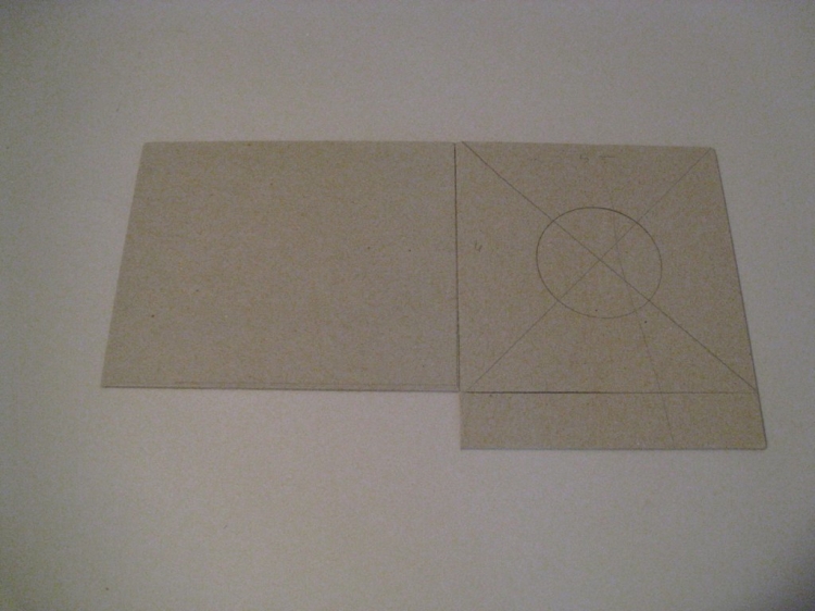
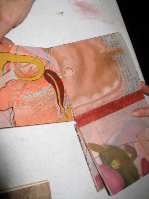
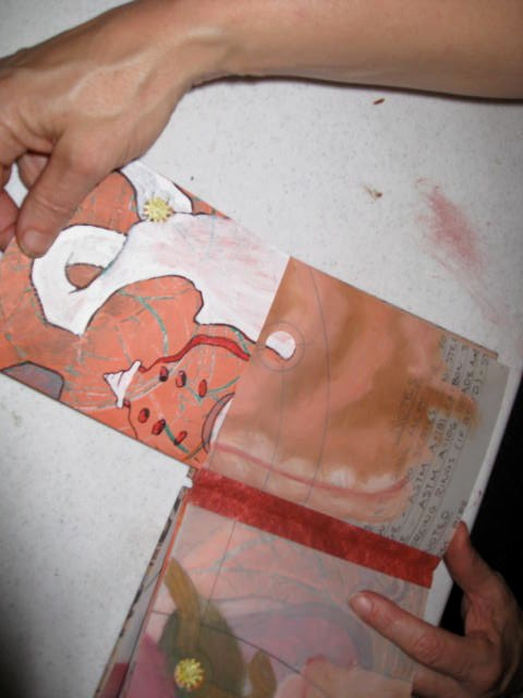
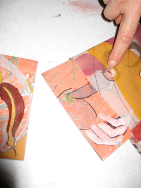
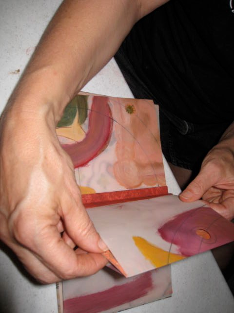
The method of assembly and binding  I used with the Burning Me Open is a good fit. Using the PMA that is on the copper leaf to hold each of 2 plexiglass pieces together. Pictured right the foil is affixed to one side of the plexiglass. Bits of hair were put onto that surface, the release paper pulled off and the other piece of plexi placed on top. The edges are then taped together with copper foil.


hair 2001.1

I have had this silly book –  The History of Hair . . . An Illustrated Review of Hair Fashions for Men Throughout the Ages –  for many years. Published in 1960 it includes a chapter called Look Into My Crystal Ball (The Twentieth Century). The text for my book Hair 2001, is taken directly from that chapter.

Hair 2001.8


Here are some predictions (paraphrased), the authors made for the year 2001:

According to Coiffure Masculine, by 2001 75% of the male population will be wearing wigs.

Not, however, to conceal baldness, but as fashion accessories.

These wigs will not be a camouflage for natural hair.

On the contrary, they will be worn with great personal pride.

Wigs for different occasions will appear on the fashion scene

Wigs for work. Wigs for dancing. Wigs for dress.

It is predicted that by the year 2001, baldness will be obsolete.

hair 2001.6

These predictions I’ve prefaced with the questions, also paraphrased from the book:

By the year 2001, will a lunar hippie protest by means of a closely-shaved scalp?

A balding Astro flash a pair of false eyebrows to offset a full magnetic wig?


hair 2001.3

hair 2001.7

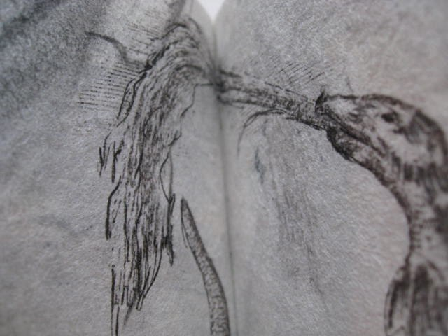
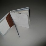
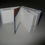
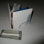
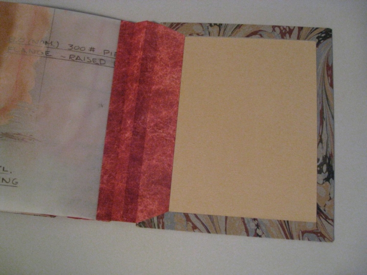
The 6 rigid pages consist of laseretch plexiglass, hair, copper foil and copper tape, bound in a variation of an across the spine coptic style first introduced to me by Keith Smith and found in his book Smith’s Sewing Single Sheets. They are sewn with heavyweight linen twine. The covers are of Cocobolo wood that I get from Bell Forest Products. This is a wood that is too oily to glue well, but for sewn on covers it works very well. Those same oily properties means this wood polishes beautifully. The covers of Hair 2001 are waxed – smooth and silky to the touch.

As an aside, Cocobolo wood also has a strong odor, a very pleasant tangy floral order, sort of like my shampoo. The front cover has a window cut out, into which a sandwich of mica, plexiglass and hair is inset.

I am well pleased with this book. The size (The book measures 3 1/2 x 3 1/4 x 1 5/8 closed) and weight of it feel good in the hands. It is visually enticing and well constructed. The content makes me chuckle.

Posted on Leave a comment

Yearning for Morgan

Yearning for Morgan1

Yearning for Morgan2


Coming up in October is the fourth Annual Fundraising Auction at the  Morgan Paper Conservatory in Cleveland, OH. Each year they invite artists to create a piece using paper made at the Morgan. This year is the second time I’ve participated in this fundraiser – The Snail Mail Paper Trail. Snail Mail because they mail sheets of paper to any artist who wants to participate. Paper from the Morgan is a treat to work with – they know how to make paper at the Morgan! This year I received 3 sheets, in two different tones.


The first one I sent, last year, is blogged about here.


This year I created a book utilizing an alphabet I created several years ago – the alphabet is pictograph based, rather than phonetic. I like to think of it as a good general purpose alphabet and is  always expanding in that I’m always creating new elements for this alphabet. So it is an unfinished alphabet, or rather a work in progress.


Yearning for Morgan5


The title, Yearning for Morgan, operates on more than one level. It is literal – a selection of yearning alphabet symbols presented in a book created for the Morgan. But also, when I think about places like the Morgan, places I imagine to be rich with ongoing projects, like-minded artists working during residencies, workshops and exhibitions, I am filled with a yearning to be in one of those places. Denver doesn’t have such a place. This goes even deeper; at times, I yearn for a different life.


And, buried even more deeply, is my yearning for my old Morgan mare, Reba. Reba was the last horse I owned and I sold her several years ago. She was a great horse, and I always assumed I’d get another Morgan mare sometime but I haven’t yet and now that I’m living in a city again, I probably won’t. Recently I decided to sell my old saddle and tack, but haven’t gotten around to it. I still have tack, and old gymkhana ribbons dating back to my very first horse, the horse I got in 1969 – 42 years ago. Maybe I’m just yearning for my life to be a little bit different. To be filled with a promise and excitement that is a little elusive in middle-age.


Yearning for Morgan4


Yearning for Morgan3


Back to Yearning for Morgan, this book was made by cutting the characters out of one of the cooler toned sheets of paper (using a laseretcher) and mounting those pages to folios made from the warmer toned sheets of paper. Underneath each character is the name I’ve linked to the character. The book is bound in a millimeter style binding with paper covered board covers and calfskin spine. The cover title, title page and colophon are laser transfer. It measurers 5 1/2 inches by 4 1/8 by 3/8 inches. And I also want to mention that the characters I use for laseretching were converted to EPS so they can be read by the laseretcher by my friend & Adobe Illustrator genius Shannon Perry.


Yearning for Morgan6

Posted on Leave a comment

Book a Week – round 2

Two years ago, about this time of year, I initiated a book a week project. I’m feeling twitchy in that same way so am going to do it again. For this round I’ve changed the rules. Now I’m interested in speeding up my process for finishing up. So the intent is to do just that – whether it is an unfinished project worthy of completion, or determining a use for various materials set aside for a project ‘someday’ .

As an aside, the current trendy description of my comfort zone is that I’m a ‘renaisance soul’ – this means that my interest in completing projects is always duking it out with my interest in new projects. So, I have a lot of unfinished projects around.

Another of my realities is that it is hard for me to pitch things – this issue is multi-layered and deep; no need to go into all that now. Sometimes by treating heretofore unfinished projects as a new project, with a series of new challenges, I can trick myself into finishing projects that, with the passage of time, still seem worthwhile finishing.

The first, which I have to finish this week, will be for the visual journals show. I don’t often exhibit at my own gallery, but do sometimes use my curatorial ideas as incentive to do something I’ve wanted to do before.

WIP solo nav 5
Solo Navigations I – 2008

This book binds several individual drawings I made in 2008 into a book. These pages were made over a period of several months in 2008 mainly to combat the tedium of waiting for performances (mostly live music at various clubs) to start. Arriving early enough to get a good spot meant waiting a long time for the performance to begin. I’d get fidgety and bored and sometimes felt conspicuous because I was by myself.
Solo Navigations I I made myself a little kit that fit easily into a handbag and worked on these pages to wile the moments away. The rule for the writing was to write of things going on in the moment, either internally or externally. Every space had to have a letter, so there are no spaces between words, and no punctuation. When the end of a row of grids was reached, I’d turn the paper 90 degrees and continue writing. After making just a few, I decided to designate a few blank areas on the gridded page that I could later work on in the studio.
WIP solo nav 2

I wanted to use an approach to binding Don Glaister recently taught in a workshop sponsored by the Guild of Bookworkers, Rocky Mountain Chapter. The workshop was held in Kozo’s new rental space in June. Sort of a modified photo album structure, where guards are incorporated into the pages at the spine edge; those guards are folded over, sometimes multiple times, to create enough thickness to accommodate the thickness of the page being bound. This book doesn’t have particularly thick pages, but I did need to fashion a method to bind single sheets of a material that doesn’t fold well – the gridded, frosted mylar the drawings were on.

I mounted each maylar page to an inner page of white Utrech drawing paper. Before I mounted the mylar, I painted colored shapes to the drawing paper, to add more depth to the drawings.

I often do this sort of thing – adding elements that may ultimately be invisible, or at least difficult to see. I want to include those elements but don’t always want them to be articulate. A visual mumbling.

The pages are mounted to the drawing paper, now with colored shapes painted on them, with PMA. The PMA is transparent and, as a dry adhesive, doesn’t cause the paper to curl. Works great for sticking porous surfaces (paper) to non-porous surfaces (mylar).

The drawing paper is cut larger than the mylar at the spine edge, the edges that stick out are what the tabs for the hinges are made from. I then sewed the pages using a supported link stitch on tapes and cased the block into a split board cover.
WIP solo nav 3

This resulted in loose tabs between every sewn signature. After the book was sewn up, I decided to add more pages by tipping in mylar drawings, these in black brushstrokes, to those tabs. The end pages are scraps of old prints from the same year the pages were originally made (2008). The cover boards are covered with some of my photographs, taken and printed in the late 1980’s.

Voila – Solo Navigations I – 2008. Finished in time for the exhibition Visual Journals at Abecedarian Gallery.

Posted on Leave a comment

Someone Like You and Education of Girls

WIP-Someone-Like-You-5WIP-Someone-Like-You-6
I’ve been working on these two books simultaneously. They are part of the Lovely and Amazing series of works inspired by and created from an archive I inherited from Ruth Wheeler, who was my great-aunt. Both completed in 2010, they have been exhibited at Bookopolis in Asheville, NC and in at Vivo Contemporary in Santa Fe, New Mexico.

The covers were begun in a workshop held at my studio in 2008, taught by Boston artist Peter Madden. That workshop was held only a few days after my mother died; Peter’s mother had died only weeks before. We both decided to go ahead with the workshop but I confess here that I remember little of the workshop, the creation of these wood panels or what my intention was. I think I was just working to be working. Shelved for a time, I then created some triptych wall pieces that ultimately I deemed unsuccessful when nearly complete. Once again, shelved for a time. I mention all this because it addresses one of my theories about an ingredient in mixed media construction that I believe adds to their richness in an essential albeit non-visual way. The best I can do to explain this is that a construction made from ‘store bought’ materials (i.e. materials without a previous, rich history), even though in composition, arrangement and general selection of objects may exactly mimic, for example, a Joseph Cornell construction, it cannot speak in the same way, isn’t imbued with the richness that history gives to objects.
WIP-Someone-Like-You-1

These panels, although constructed from newly milled pieces of birch plywood, have a short history but in that time have been altered and handled repeatedly. Many of the objects now embedded in or attached to their surfaces come from an old archive. The process of shelving and continuing work at a later date adds to these final pieces in way impossible to achieve otherwise.

Both books are coptic bound with rigid pages but they were constructed differently from one another.

The first I completed is Someone Like You. This book takes as its title a handwritten poem transcribed in Ruth’s journal:

Someone like you makes the heart seem the lighter Someone like you makes the day’s work worthwhile Someone like you makes the sunshine the brighter Someone like you makes a sigh half a smile


IMG_1719_0033

This text appears split in two on the inner front and back covers in a scan of Ruth’s original handwriting and is then repeated on individual pages throughout the book.


The pages are each made of a layering of photographs (scanned and reproduced via inkjet) taken by Ruth on her camping and picnicking outings with her Camp Fire Girl troops over a span of many years. Also included are pages from her teaching notebooks detailing nature games, pages from her biology notebooks with sketches of specimens and plates from her nature books.

Each page is constructed by treating the front and back as separate pages that are hinged with book cloth around a thin metal rod. So, although the pages are rigid, they can be stitched without the cord intruding on the page surface as the metal rod holds the thread in place, as the fold in a signature book would do.

WIP-Someone-Like-You-7

These pages are rather inelegantly bound with linen cords, the front and back covers have round recessed areas that for a title label (front cover) and image (back cover) with brass pins holding the labels in place. In order to prevent the weight of the book resting on these pins when the book is lying flat, I also added pins and brass beads to each corner. These double as a mechanical means to hold the larger mica pieces on the cover.

The covers were drilled halfway through outside to inside after the mica is in place, those holes met with secondary holes drilled in from the spine edge. This allows the thick cord to wrap around the outside of the cover but not be inside of the cover. The book closes without the additional bulk the cord would create on the inside.
WIP-Someone-Like-You-1


Education of Girls takes its title from a teaching pamphlet Ruth used. As the junior high biology teacher, Ruth’s job included teaching sex education and this pamphlet was from a multi-piece set of she used.

WIP-Education-of-Girls-10 In addition to scans and print outs from her teaching notebooks, the pages include small bones/feathers/seeds/plants and film positives recessed into the pages and scans of artifacts too bulky to be included in the book (such as taxidermied songbirds).
WIP-Education-of-Girls-5

The pages of this book were constructed with a museum board core, the text and images built up on each side. The thickness of the rigid pages meant I could embed the objects mentioned above and could use the more intrusive rigid page binding technique as described in Keith Smith’s book Sewing Single Sheets. This technique also doesn’t require each page be of uniform thickness.


So on two of the pages strips of film positive were sewn into the pages in a way that makes the positives visible from both sides. Those pages were then wrapped with handprinted book cloth on the edges to both protect the positives, hold the protective layer and add enough material to the pages to hold the intrusive coptic thread in place.
The text is primarily transcriptions for audio recordings I made of conversations I had with Ruth during her 97th year about some of her teaching accomplishments and adventures. Also included are pages from the original Education of Girls pamphlet, and a photograph of Ruth’s mother and aunt, with whom she travelled to Columbia College in 1928 so Ruth could take a summer course in sex education.


Both the front and back covers have mica recessed over paper artifacts. This recessing of the mica meant I could avoid having pins protrude from the covers. Each cover also has a hold drilled entirely through it. These cavities hold artifacts (one shell each front and back) suspended between layers of mica.

I wanted Education of Girls to be more elegant than Someone Like You so I bound it with much thinner cord, 4-ply waxed cord.
In this case I did wrap the cord through to the inside, which makes the cover hold tighter to the text block and not be quite so floppy.

WIP-Education-of-Girls-8

Posted on

Wind, Water, Stone

IMG_0511

For this piece I created a series of three books that, although they result in one boxed set,  I worked on for three weeks during the Book a Week projects. The three books are made with  porcelain book covers I made years ago but never found the right content for.  The text use some monoprints printed off plexiglass onto lightweight Japanese paper using an etching press.

Covers:

IMG_1317

Years ago I wanted to work more with clay so I took a class with a Denver area ceramicist, Mary Cay, at the Art Students League of Denver. Mary works with porcelain which really is the only clay body it makes sense to use for bookcovers. Fired to high temps,  porcelain is strong and makes a wonderful sound when it touches itself. I spent most of the workshop on these three small sets of book covers. We used a clay body called Zen, so I imaged with covers markings that seemed zenlike. After multiple firings the covers were put on the shelf. For years . . .

IMG_1315

Content:

Octavo Paz is a favorite poet of mine . . . I have a text based on his poem Wind, River, Stone which, I hasten to point out, is not a real translation but a re-wording of his poem that better suits this project than the more accurate translations that have been done. This one is more casual.

Water hollows stone,

wind scatters water,

stone stops the wind. Water, wind, stone

Wind carves stone,

stone’s a cup of water,

water escapes and is wind.

Stone, wind, water.

Wind sings in its whirling,

water murmurs going by

unmoving stone keeps still.

Wind, water, stone.

Each is another and no other:

crossing and vanishing through their empty names:

water, stone, wind

wind water stone

I selected portions of the monoprints, cut and folded them to size. I imaged the text via laserprint transfer on the back of the pages. As the pages are lightweight the text shows through as a gray rather than a black.

Each book contains one of the three first stanzas with the final stanza repeating in each book.

wind water stone

I then made individual boxes for each; the labels on each box are created by laser transfer onto the monoprint scraps; those three boxes are in turn housed in one larger box, the front cover and spine label produced in the same way.

wind water stone

I am very satisfied with the interplay between the weightiness and density of the porcelain covers and the lightweight, airiness of the text blocks. Both materials are fragile in entirely different ways from the other.

wind water stone

Owned by University of Denver, Penrose Library, Special Collections.

Posted on Leave a comment

Boston – Sept 19, 1901, October 15, 1901

This book was recently purchased by the Boston Atheneauma membership library thatfirst opened its doors in 1807. I am well pleased by this placement, facilitated by Vamp and Tramp Booksellers, who carry other unique and limited edition works of mine.

The book was created from glass plate negatives made by my great-great-grandfather George Carpenter Wheeler in 1901. The negatives ere made between September 19 and October 15 of that year and are of public areas in the Boston area. 9_19 & 10_5 -1901 bookc.jpgI scanned both the negatives and the disintegrating envelopes they were stored in, and printed them via both ink & laserjet. The negatives and prints from the scans are bound wire-edge style.
Comes in custom box of wood, bookcloth & book board. glass plate negatives, inkjet prints, brass, book cloth, paper, book board, in custom box9_19 & 10_5 -1901 booka.jpg

I have more of these negatives and plan to create a similar book from them. I will photograph, post and describe the steps taken during the construction of the second book. But for now, I have only photos of the finished work to show you here.

9_19-&-10_5-1901-booke.jpg9_19 & 10_5 -1901 bookb.jpg

Posted on Leave a comment

Snail – class Gastropoda

IMG_1343To celebrate their upcoming one-year anniversary the Morgan Conservatory, a paper and book arts center in Cleveland, OH sent me two sheets of their handmade paper with the request that I make a piece — the instruction was simply to ‘to as you like incorporating the paper provided.’
WIP Snail 5
Each sheet of the 12×22 inch paper is gray but of slightly different values. The fundraiser is called the Snail Mail Paper Trail so I made a book called Snail class Gastropoda, and decided on a meander book structure. Meander books are easily made from one sheet of paper, but I opted to create panels and stitch the panels together rather than using a fold.


Using a large punch with a spiral pattern, I cut some spirals out of the lighter toned paper, then hand cut some freeform shapes resembling snail trails keeping the cut outs to use in the box. I then laminated the sheets together, and cut the laminated sheets into 8 square panels, each about six inches square.

IMG_1337

To minimize the problem of thread tearing the pages at the joints, I cut some mica washers in half, glued them to the paper edges and sewed through both the mica and the paper at each sewing station. I used lightly waxed linen thread and opted to leave the tails of each thread dangling. The text, a piece I wrote using found poetry techniques with Wikipedia as the original source, is laser transfer.


Snail class Gastropoda


found in ditches, deserts, the abyssal depths of the sea.


snails with a gill can be found on land


snails with a lung found in water


gliding along on a muscular foot


covered with epithelial cilia


waves of contractions


move down the ventral.


they walk over razors


a layer of tissue covers the visceral mass


snails need calcium


(the operculum of some has a pleasant scent when burned = incense)


most bear tentacles on their heads


eyes carried on the upper stalks


lower set olfactory


a snail breaks food using radula


chitinous structure microscopic hooks cuticulae


in a quiet setting, a snail can be heard crunching


radula tearing, eating.


the snail grows, so does its shell


secreted material added to the edge


the center of the shell’s spiral made when the snail was young


hermaphrodites


snails perform a ritual courtship


inseminate each other


each brood +/- 100


snails need calcium


eat the egg from which they hatched


cannibalization by babies of other eggs (even unhatched) has been recorded


The paintings of snails are watercolor/gouache. Each page was coated with conservator’s wax after transferring/imaging.IMG_1334
IMG_1339

As much as possible I like for my work to include artifacts that have a relationship to the piece, in this case snails. I used a wooden frame with recessed plastic glazing for the box walls. I filled the recessed area with sand and snail shells, covered the plastic with a layer of very thin and translucent Japanese paper, laid in the cut shell and snail trail shapes I’d earlier cut out from the handmade paper, then added another layer of the thin Japanese paper.
IMG_1338The inside of the box walls are covered with gray moriki paper, the outside and top edge of the box walls with multiple layers of Thai unryu. The tray was then affixed to fabric and paper covered book board. A ribbon pull makes it easy to pull the book out of the tray without damage. The box label is laser-transfer.

Technorati Tags: , , , , , ,


Posted on Leave a comment

A Little Book of Drawings


A Little Book of Drawings

I have, in my adult life, moved literally tons of objects from place to place. The decision of whether to keep or discard is ongoing and I fear my elder life will be ruled by objects, much in the way of my parents. This I find disturbing and I continuously work to rid myself of objects using criteria that varies hugely from year to year.

Some collections, such as art books, don’t come under scrutiny too often. The music collection morphs into another version of itself (records replaced by audio cassettes, those replaced by CDs and those transformed into MP3 recordings). It makes sense to keep studio materials even though my emphasis in the studio and thus material use has shifted course many times over the years.

One area I haven’t figured out how to manage is the mass of unfinished, unsold, unframed artworks. Somehow simply throwing them away doesn’t seem an option, and I don’t really consider giving them away either. Re-purposing is a favorite strategy; a project with a layer already rich with pigment and potential a rewarding way to spend some time.


This week I made A Little Book of Drawings (measures about 3x3x.5 inches). I started with old figure drawings on mulberry paper, cut them up and ordered them into signatures. Both before and after sewing the text block, I further worked the drawings with ink and some transfers. The signatures were sewn with a supported link stitch and hollow back cased in with a variation of a split board (or tongue and groove) technique. The book has a leather spine and handwritten title.

Above are some photos that show the various binding steps: the brown paper is a moriki that is attached to the hollow tube and then extends, creating the tabs (tongues) used to attach the covers. The white material with blue edges is 2 ply museum board used for the inner board (rather than actually splitting a board, 2 boards create the ‘groove’ where the tongue is glued in). The end sheets are then pasted down leaving a hint of the blue exposed. And, as you can see from the leather spine, I didn’t get it right the first time, had to detach and re-attach the leather. Fortunately I use paste with leather so re-doing the spine didn’t ruin the book.  I am pleased with this book. It has a richness last week’s project did not; has evidence of my history as a mark maker, evidence of passable skills at binding small books. As I ponder this book, I decide that part of its success lies in the various qualities inherent in the materials themselves. Mulberry paper, graphite, ink, thread and leather.

Posted on Leave a comment

Picture Book

Alicia Bailey - Picture Book


I find it difficult to make books without words, although I appreciate both impulse and outcome in the work of others and in my own mind. I suspect I rely too much on words to impose structure and to obscure any lack of stand-alone brilliance my images may have. So, for this book I use no words other than the handwritten text on the re-purposed drafting mylar used in the book.

With only a few hours for this project, I decided to use pages already imaged from a previous project. I cut up a sheet of drafting mylar that I’d intended painted and intended to use in an earlier book.

I enjoyed making this picture book. Without having to be concerned with issues of text (selection/editing/layout) I was able to enjoy other aspects. With ordering a different issue than it is with text, I opted for a page format that allows the images to be re-arranged.

The images are placed in translucent sleeves, easily removed but held in place by friction. Holes punched in the mylar, with foil shapes behind provide a guide for the ordering and placement I decided on.

The book spine is a concertina of tinted tyvek. The mylar sleeves are sandwiched between two  pleats; each page has an additional spacer pleat in between. The tyvek extends beyond the spine and is used to attach the covers.

When working with tyvek I to use double stick tape or PMA if I can as tyvek isn’t absorbent enough for most liquid adhesives. Heat activated adhesives will melt the tyvek. The covers of this book feature hand-marbled paper from Pamela Smith. The front cover has a recessed circular label with an image from the Jouissance series.

Posted on Leave a comment

That Milksnake Story

Alicia Bailey -That Milksnake Story
Alicia Baliey-That Milksnake Story

I have some beautiful papers from Cave Paper that they call “skins” – it is translucent and crackly, a good fit for the inclusion of snakeskins, which I also have a supply of and a fondness for. There is a single sheet structure that I have seen referred to as a maze or a meander book but the reference I like most (and that I can’t find now that I’m looking) is a snake book (I think Scott McCarney calls it this). An obvious structure choice for this book. –

Another trigger was a book I had in the studio Reptile Medicine and Surgery by Douglas R. Mader with beautiful reproductions of reptile anatomy.

Alicia Bailey - That Milksnake Story 3

After folding and cutting the paper, I painted with gouache on both front and backsides. I have lately been using a writing technique similar to those used for found poetry. My texts do not necessarily conform to poetic form but the guidelines are similar. Text on the frontside was created from an article published in the July 3, 1930 Walnut Grove Tribune – a bit of folklore (what might today be called an urban myth) about the milksnake.


That Milk Snake Story In the pine barrens I caught a large snake black-and-white serpent immune to the bite of any The sight started a line of snake stories. A cow that suddenly went dry watched, she would go to the far pasture low invitingly A snake would creep out of the grass milk her. When the snake was killed quarts of milk gushed out. The cow pined away and died. A sad story; true as most.

On the backside is a text written from various encyclopedia entries, again, using found poetry methods. I digitally formated my writings to fit this book then laser transferred it to the bookpages.

The oviparous milksnake whose clutches average ten starts with three, or four or even twenty more in humus or under rot eight weeks later the precocial young need precious little more (brightly born they dull with maturity) even the largest of milk snakes could no more milk a cow than could a bird

For the cover I sandwiched some snakeskin bits in between 2 circles of mica and, because the mica is transparent, it is possible to see through the mica to the image painted on the first page of the book.


The book when closed measures 7x6x3/4 inches, and extends open to 7×22 inches.

This final images shows the page orientation etc. of the book, and that it remains really, a one sheet structure.

Technorati Tags: